An office/retail building in Austin, Texas, addresses two different areas: a commercial strip and residential neighborhood. The mixed-use building also connects with nearby and local architecture. Furman + Keil Architects PLLC used a particular combination of special detailing, building materials and landscaping to meet goals for the project. The architecture firm, which has its office on the second floor of the two-story building at 1211 E. 11th St., also designed it with energy-efficient, flexible spaces adaptable to future changes in use.
Saddling commercial and residential areas, a highly detailed mixed-use building joins the two
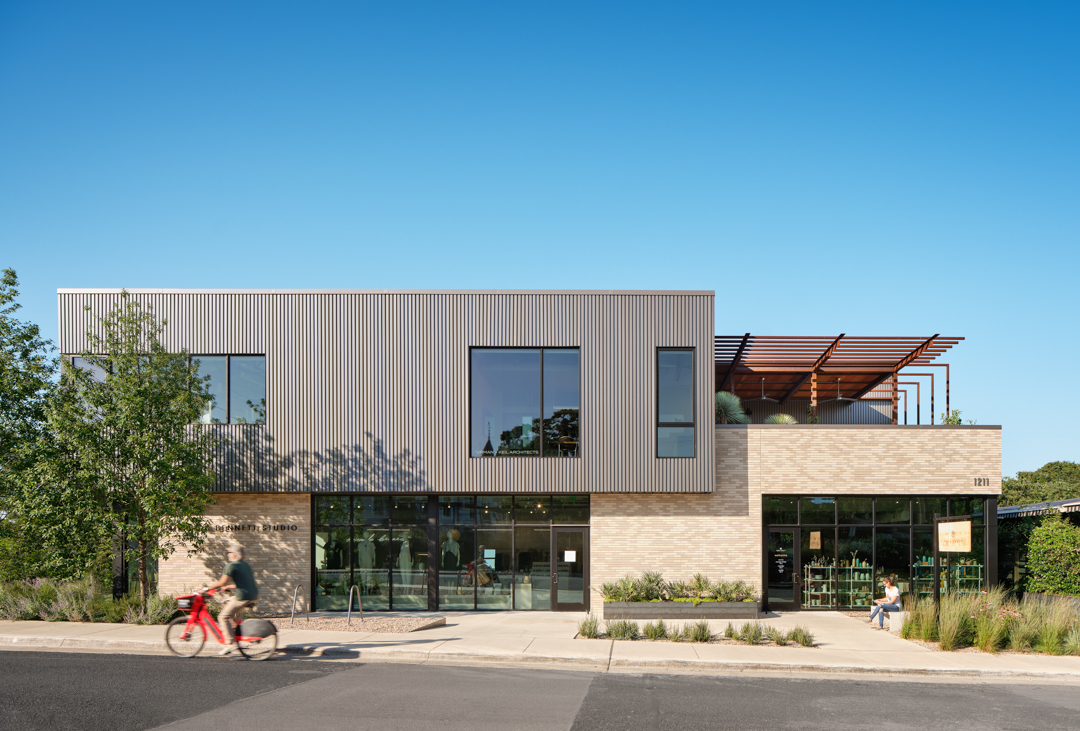
Photo: Casey Dunn
Commercial/Residential Transition
To mesh with the two different areas on its corner lot, the commercial streetside and residential area, the two floors are like two boxes stacked perpendicular to each other. The first floor has masonry walls and is aligned lengthwise with E. 11th Street, a main street. The second floor, which is clad with vertical, box-rib metal panels, is rotated 90 degrees from the first floor and aligns with a side street, Navasota Street.
Philip Keil, AIA, principal at Furman + Keil, says, “The building’s form is really very much derived from that corner condition. The two floors are stacked rectangles with the top rotated.”
At the commercial side, storefront glazing displays retail tenants for passersby. The pedestrian level is further engaged with the building via a second-floor terrace with a weathering steel trellis. “Because the top floor is rotated 90 degrees relative to the lower floor, that sets up the condition with the trellis and the terrace on the upper floor,” Keil says.
Instead of an enclosed building at that corner, having the terrace with the trellis draws attention to the building where it faces activity on the street, Keil says. “It really makes it a onestory corner instead of a two-story corner. And then that condition of having people upstairs makes it a more human-scaled building and connects the people upstairs and the people on the street. Having that exposed structure instead of walls, allowing you to see the beams and the members of the trellis, adds a little bit of interest and liveliness to that part of the building rather than just simple walls. The decorative nature of the trellis and the plants on the terrace soften that corner.”

Photo: Casey Dunn
To respond to the residential area, trees and other landscaping wrap around the building’s Straddling commercial and residential areas, a highly detailed mixed-use building joins the two east corner. “Our building is the first thing you see as you’re coming into the strip from the residential side, so we really thought of the building as a gateway,” Keil says. “So, there are trees and a fairly heavily planted zone at that corner of the building. There are a couple of trees right in the front on 11th Street. They wrap the corner and there are several other trees on the east side. We had to make it feel friendly facing the neighborhood so that we weren’t just presenting a bunch of hard surfaces, that we were really having this shady, lush, planted front.”
Another way the design adjusts to the residential side, from the occupants’ perspective, is by opening up via windows lots of views overlooking Texas State Cemetery. “If you look east, you’re looking out at this beautifully landscaped cemetery,” Keil says. “And then if you look to the west, you’re looking back toward downtown. The second-story rectangle is rotated 90 degrees to the first floor, which gives all the office tenants upstairs views of the cemetery and the downtown skyline. So that corner condition, the context of the street and where we are in the city, is really what drove the building’s form.
Neighboring Inspiration
The building is designed to relate to architecture in its immediate vicinity and other parts of East Austin. In terms of size, another benefit to the second-floor terrace having the feeling of a one-story brick building at that corner is that it doesn’t overshadow a one-story restaurant next to it. It also blends it in with other one-story masonry buildings on the street.
Keil explains, “The lower floor is a one-story brick volume facing the street that was very much intended to recall and align with a lot of the historic brick buildings on the street. They’re all more or less one-story masonry structures including our next-door neighbor, which is a restaurant. The important things to us were that it fit into the neighborhood, both in terms of its size, not to have some massive, oversized building, and also the materials including the brick were important to connect it with other masonry buildings on the street.”

Photo: Casey Dunn
Another way the first-floor volume relates to other brick buildings on the street is the color of the masonry: tan and white. “The coloration of the brick that we use is meant to blend in with those buildings,” Keil says. “There’s an old brick in town that is not made anymore called Austin Common Brick, and it has this sort of buff tan color to it. So, the buff tan color we chose for the brick was very much intended to align with the old Austin Common Brick.”
In addition to connections to nearby architecture, the building’s metal-clad upper half and weathering steel elements were inspired by industrial architecture in other parts of East Austin. “The materiality is important in that if the brick is relating to the other historical buildings on 11th Street, then both the metal siding and the rusty, exposed metal are inspired by other types of buildings in East Austin that were historically old warehouses and industrial buildings that have been over the years converted into cafés and retail stores. There’s sort of a scrappiness of an attitude about them here. Instead of tearing down an old warehouse to make room for a brand-new building, a lot of those old buildings have been repurposed and retained and revitalized, which I think adds a lot of character and that sort of funky, low-key feeling to the neighborhood. We wanted to create a new building that had that same funky, semi-industrial, low-key character to it, not something overly refined or too slick.”
Brick by Brick; Rib by Rib
In terms of the building’s modern industrial design, an important way its modern slant is expressed is detailing of the masonry and metal panels.
“The whole building was dimensionally planned around the size of the bricks,” Keil says. “And on the upstairs, all the dimensions we laid out relative to the rib spacing of the box rib. That allowed us to use a fairly inexpensive material, the metal sliding, in a way that became a really elegantly detailed material. It’s subtle, but quite refined.”
The dimension of the bricks was used to plan where windows were placed in the masonry walls, as well as the exact sizes of the building walls, Keil says. Similarly, on the second floor, the architects designed the windows to be placed without interrupting box ribs and to terminate at the precise ends of box ribs.
“We detailed it in such a way that the windows and the corners aligned with the box ribs of the metal panels. So that pattern just becomes uninterrupted and it allowed us to have a very thin and subtle trim around the windows and no trim on the corner. That subtle and careful detailing is the thing in my mind that really takes this inexpensive material and elevates it and makes it much more elegant, much more refined. It’s one of those things that just makes the building pop a little bit, even though it’s using these common materials. The precision of detailing that we did allowed that clean precision of the material to come to the forefront. I think if we hadn’t have done that level of figuring and detailing, then that kind of taut elegance of that material wouldn’t have stood out. It’s like a tailor cutting the suit just right so that the material shines instead of the workmanship.”

A plan detail shows the outside corner condition of the metal panel with a custom brake metal profile at the corner. It also shows the custom inside corner condition, the condition where the metal panel meets the brick veneer and the detail at a window jamb. Image courtesy of Furman + Keil Architects
Energy-Efficient, Flexible Spaces
As the principals at Furman + Keil Architects are the property owners, they had a vested interest in all aspects of the project. When it came to designing the interior, Keil says it was an important goal to make spaces flexible for different amounts and sizes of tenants.
“The downstairs space right now is occupied by two tenants, but we designed it in such a way that walls could be moved and it could be three smaller retail spaces, or a lot larger one for a large tenant. You could remove the interior wall or move it. And it’s the same thing upstairs. There’s essentially a wide-open space with a couple of dividing walls separating three office spaces, but it would be very easy to convert it to either three, medium-sized offices, or six, much smaller offices, or one bigger office. We added that long-term flexibility.”
In relation to energy efficiency, the entire building has continuous insulation. “We use a continuous rigid insulation that completely wraps the building; it’s like a Yeti cooler,” Keil says. “And then that whole system, underneath the insulation, has a fluid-applied air-and-water barrier on it. So, it’s built to current, cutting-edge standards for that kind of wall envelope; it’s airtight, continuous insulation to minimize the thermal bridging.”

Photo: Casey Dunn
For HVAC, Keil says they chose a variable refrigerant flow system (VRF) from Suwanee, Ga.-based Mitsubishi Electric Trane HVAC US. “They’re extremely energy-efficient units, and they also provide a lot of flexibility because you can have multiple indoor air handlers attached to a single exterior unit. So that played into two things. One, it played into that tenant adaptability that you can expand or contract the spaces and the AC system can be modified to suit that very easily. And then it also is just a very energy-efficient air conditioner, so it reduces your user costs compared to putting big package units on the roof.”
Primary Elements
In terms of building materials and landscaping, there are four primary elements: light brown masonry on the first floor, dark gray metal at the second floor, weathering steel elements (trellis, staircase and balcony railings and infill panels), and green trees and foliage.
“If the metal and the brick are like your pants and your shirt, the landscaping and the rusty steel are sort of the jewelry that decorates it, softens it, adds character for a little friendlier building,” Keil says.
On the inside surfaces of the railings and infill panels, a penetrating wax finish was applied. “We used a wax finish to make the feel of the metal a little bit more tactile, easier to touch, and it holds that raw steel look,” Keil says. “On that exterior, there’s no finish at all, so it’s just left to rust. It’s trying to be a little bit industrial, but sort of a refined, elevated industrial.”
Similarly, the coating on the box rib panels was chosen to express the modern industrial aesthetic. “The coating on the metal has a slight metallic flake in the paint. We like the gray because it was sort of a background, neutral color, but that little bit of metallic flake in the coating really makes it sparkle a little bit more and takes it very subtly out of the industrial.”
Sheet Metal Professionals LLC, Waco, Texas, installed Louisville, Ky.-based Metal Sales Manufacturing Corp.’s T10-A 24-gauge aluminum box rib panels with a fluoropolymer coating in Mystique Plus. Sheet Metal Professionals also installed Metal Sales’ T10-D 24-gauge aluminum soffit panels with custom returns in Mystique Plus.

Photo: Casey Dunn


